Pando Design System
DOJO - PAYMENTS PROVIDER
Dojo’s mission is to empower businesses to thrive in the experience economy, by helping them accept both in-person and remote payments, trade securely and get paid fast. The aim of this project was to tackle operational and experience issues that hindered key business goals such as Dojo’s international expansion, unlocking of new customer segments, and meeting the new accessibility laws coming into effect in June 2025.
-
Goals
The main objective of this project was to create a global design system for Dojo (called Pando) that would create a single design ecosystem across platforms, for parity between design, engineering and product. This would in turn empower squads to reuse UI components and patterns from shared libraries and provide design and engineering departments with a single language for product development.
-
My role
Senior Product Designer. I was closely collaborating with other designers and our Staff Design System Designer. I was responsible for setting the UI direction following the overarching brand guidelines, auditing current product use cases, designing components, documenting usage rules, accessibility and specs, and creating frameworks to enhance ways of working and designer-to-dev and designer-to-designer handovers.
-
Tools and Platforms
Main design software was Figma. I leveraged Human interface and Material 3 design guidelines, as well as Redix UI and Downshift component libraries. Figma and Notion were used for documentation.
This was a cross-platform and cross-product project.
The problems
Due to the rapid growth and pace at which Dojo has been moving, a few issues were identified:
Experience doesn’t feel cohesive or consistent - this results in confusing journeys for the users and increased design, engineering and product debt
Work is duplicated, alignment is hard to get and learning is done in silos - this results in more time spent managing these gaps than focusing on user problems
Code/design base is costly and difficult to scale - this results in isolated libraries that are hard to share and large effort required to hit company-wide objectives where collaboration is essential
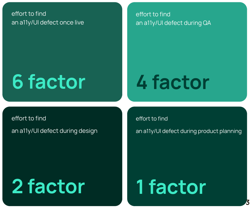
Poor accessibility standards - this results in high risk meeting European Accessibility Act requirements from June 2025

Instances of design and engineering inconsistencies across product
The vision: A design system that will…
Design for visibility
Remove today’s component library fragmentation and create a single ecosystem of repositories to allow squads to reuse UI components and patterns from other teams by means of shared libraries.
Govern with foundations
Create a set of service standards and tools for Dojo to creare good and consistent user experiences at scale. Enforce semantic design tokens used by all platforms to provide a single language for all disciplines to use.
Consolidate debt payoff
Design and business decisions are coded into a UI library as Components, Patterns and Templates. This will allow us to shape granular interactions, form repeatable user experiences and layouts.

Without a Design System
With a Design System
Setting the visual direction
Leveraging brand guidelines and initial tokenised decisions on colour, typography and iconography, I worked closely with a small group of designers to define the visual direction for Product Design. By gathering examples from existing products and defining priorities based on business value, I used short feedback loops to explore and refine designs for a set of core control components. Keeping accessibility requirements in mind and ensuring designs were scalable across platforms and modes, this initial set of components was used to identify gaps in the existing Pando’s design tokens and set guidelines for the rest of the system.

Annotated designs variants of an example of a control: text input field.
Defining the process
With our foundations in place, we wanted to start making progress against Pando deliverables. As part of a small group of designers, I helped identify gaps and challenges in the existing ways of working and worked on defining a new process for designing components. This looked like this:
Discovery
Gather existing use cases from live Dojo products
Get engineering input on platform-specific constraints
Define the scope of the component
Exploration
Start designing the component and its variants using Pando’s tokens
Research other design systems’ best practices
Design for all viewports and colour modes
Creation
Finalise the component’s IA and map all variants
Align with engineers
Stress-test and QA the component to ensure it’s accessible, scalable and the designer experience is smooth
Documentation
Generate build specs for dev handover
Document usage guidelines (i.e. Do’s and Don’ts), design decisions and content rules to help other designers know how and when to use the component

Figma template used to onboard and guide other designers.
Designing components
I worked on several controls (Input select, Segmented Control), alerts (Snackbar) and base (Cards) components.
During discovery and exploration I made sure to align with fellow designers and engineers to define the scope of the components I worked on. During creation, I used critiques and feedback sessions to:
Gather designers’ input on both UX and UI decisions for each component — Is this component right for existing and future use cases?
User test the component itself with designers to assess how the variants and property panels work for them — Is this component easy to use? Do you know when and how to use it?
Ensure a smooth dev experience — Do properties in Figma follow the right standards? Are states and variants easy to discover and understand?

Input select component states and variants, with its property panel in Figma.
Learnings and considerations
This project was a huge opportunity for me to hone my Figma skills and to apply Design Thinking to a novel area (Design Systems). I learned to see designers as the end users in a whole new dimension and truly consider how the way I structure a component in Figma affects their day-to-day design work.
I learned to design with accessibility in mind at a whole new level. Pando has incredibly strong roots in accessibility which means Dojo is now set up for success when new regulations come into play this summer.
Too-wide scopes and platform-parity can be paralysing for Design System Designers. One month in, we pivoted our approach and decided to deliver platform-specific libraries (Android, iOS and Web) and focus on our core product (the Dojo Card Machine App) to ground our components and patterns in solid and existing use cases.
-
![]()
Dojo Design System
-
![]()
KatKin Account
-
![]()
KatKin Sign Up
-
![]()
Top Gear Car Reviews
-
![]()
Top Gear Video
-
![]()
Memrise Grammar
-
![]()
Memrise Courses
-
![]()
Memrise Podcast


